Built for Teams: Recruiting Data
UX Design + UI Design
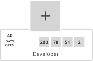
Adding a recruiting summary to open positions in an org chart product.
What does an award-winning web development company do when it can’t find an off-the-shelf product to meet its needs? It designs and builds that very product. And of course, wins some more awards in the process. When we couldn’t find an HR tool that was intuitive, modern, and flexible enough to meet our needs, we started a side project called Built for Teams. That side project is now the system of choice for hundreds of companies in multiple countries, including recognizable names such as Mount Sinai Hospital System, Republic Services, and Cornell University.
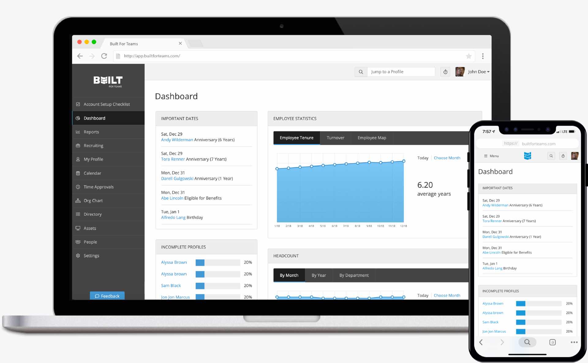
Built for Teams home screen.
The Problem
Decision makers don't have access to real-time recruiting data during workforce planning and strategy
Organization planning and recruiting data are typically disconnected, but we wondered what would happen if we brought this data together and allowed our customers to see a snapshot of recruiting information right from the org chart. An idea was born, and after a positive response from customers, we set out to design this feature.
Our Approach
01 UX DesignWe identified recruiting data needed by decision makers to support their strategic initiatives
Understanding the problem guided our research
We identified three questions to guide our research and help us dig deeper for a better understanding of the problem.
- How do the org chart and recruiting data connect?
- What information is critical for different roles?
- How do we surface this information?
We spent time talking to key personas
We talked to current and prospective customers to learn more about their needs and frustrations. During this UX phase our critical mission was to gain deep understanding of their processes and objectives. True UX design is much more than creating a sketch, and time spent interviewing customers pays huge dividends in the UI design phase that follows.

Persona: Matthew
Role: Department Head
Matthew has been a Department Head at Snyder Co, a Fortune 500 company, for 5 years. His roles include directing managers in planning and executing assigned projects, handling budgeting, workforce planning, building a positive work environment, ensuring customer service expectations are met, and achieving department goals.
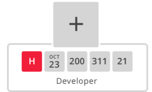
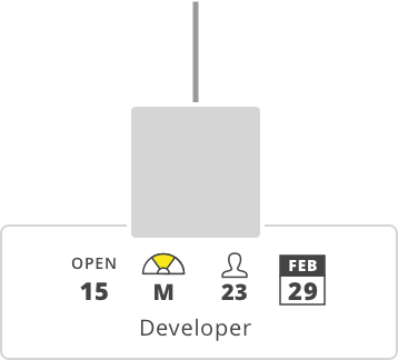
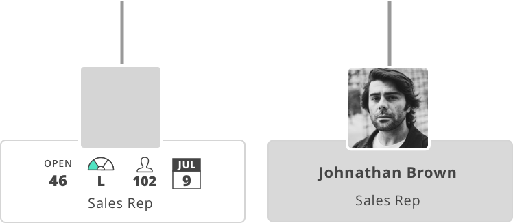
He has been developing the department budget for the next quarter and has been utilizing the org chart for the data he needs to make estimates. Matthew knows that they have several unfilled positions in the department, but he’s not sure which of those positions they are actively recruiting for and how close they are to being filled. He wishes that he could find these answers on the org chart but alas, he only sees an empty box for each open position.
An example of a key user persona.
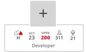
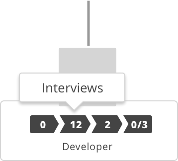
02 UI DesignWe designed custom, user-focused data visualizations and icons
Iterating and testing different versions lead us to the solution
We decided that the best place to visualize this data on the org chart was in place of a name on an open position. We iterated and tested through many ways of doing this.
Version 1
Display recruiting data in squares on open positions
Issues
- Feels off balance
- Data is too small
Version 2
Increase size of recruiting data
Issues
- Not intuitive what each square means
Version 3
Utilize icons to help the user quickly connect what each data point means
Issues
- Five data points doesn’t answer enough critical questions to meet user’s needs
Version 4
Give user two choices for how to view all open positions
Issues
- Would require us to relocate the existing menu icon displayed on hover
- User would be stuck with a single view on all positions
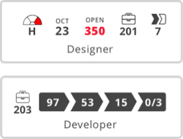
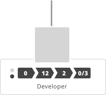
Version 5
Let user toggle between the two available data views
Issues
- Would require us to relocate our color coding panels
- Feels like scrolling, not toggling as intended
Working through these various options for each persona helped us iterate until we found the optimal solution...
The Solution
We worked around constraints to create a seamless experience for our users
We utilized the current product UI for many elements of this solution, but our final design required creative thinking and working within the constraints presented by a small open position box.
Size Constraints
Tool Tips
Toggle
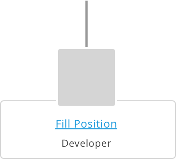
Open Position with No Job

Missing Data
Background Color
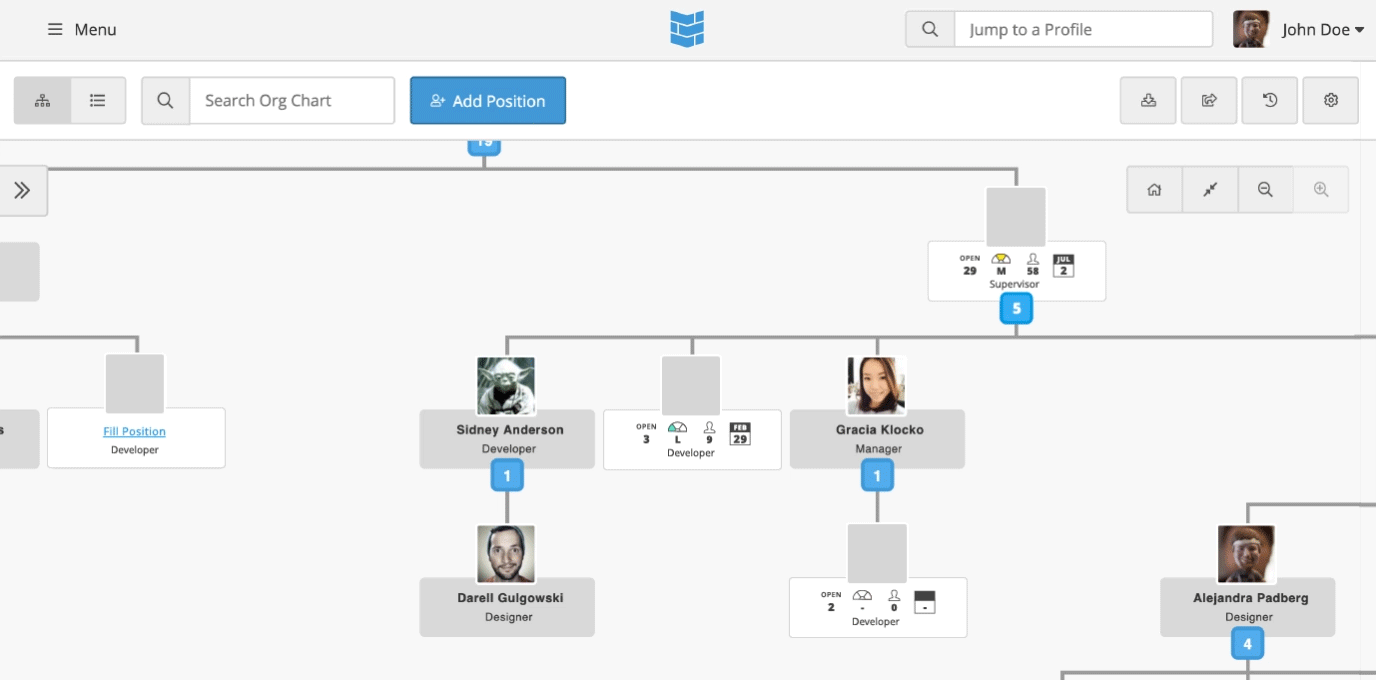
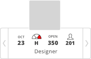
A mockup of the finished design.
We integrated the solution into the product
In order for this to work we needed to consider many details of this complex design including how the user could connect a position to a job posting, how the user could edit the information, and how the feature would function in different scenarios such as the user opting not to assign a position to a job posting or the user setting multiple job openings related to the same posting. But that’s another story for another case study. Feedback on this solution has been excellent.
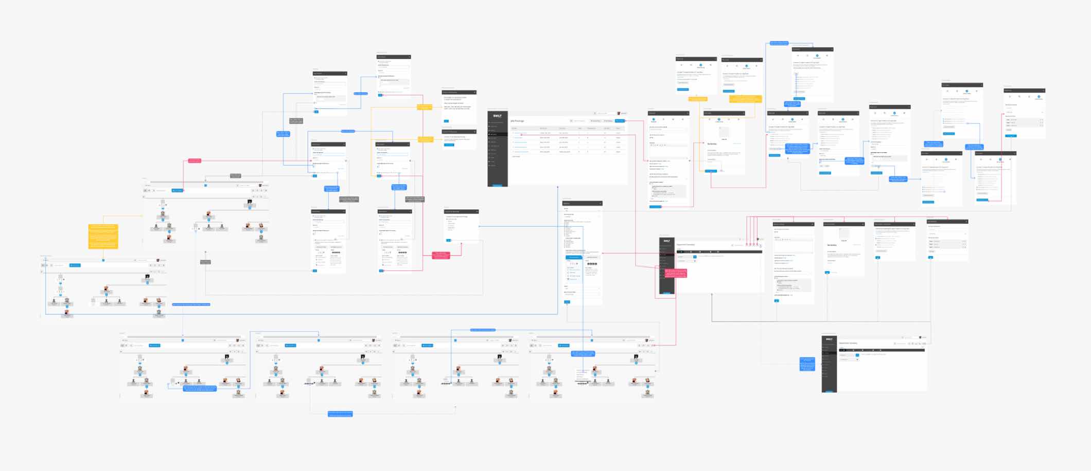
Project user flow diagram. Yeah, there’s a lot going on.